I am so excited. This week I received some draft covers for my new thriller, Fool Her Once which is due to be published Spring 2022.
I can’t share them with anyone yet. Not until we winnow them down to a more manageable number. So far, I’ve received a file with 18 — yes, 18 — draft covers from my publisher, CamCat Books.
Great Camcat Covers
 I’m very happy. One of the reasons I decided to submit to and sign a book deal with CamCat is because I really liked the book covers their artist had already produced.
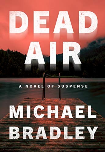
There was this one (left) — the first thriller CamCat published in June 2020. It’s titled Dead Air by Michael Bradley. For me, it was very moody and conveyed the menace which permeated the story.
Quirky
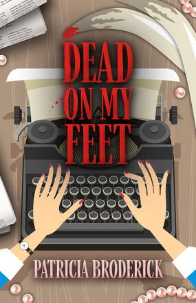
 I also love this one for Dead On My Feet by Patricia Broderick (to be published this Tuesday, June 15.) Nellie Bly (get it all you investigative journos out there??) is an obituary writer for a local paper in a Southern California coastal community where residents are turning up dead in ghastly ways.
It’s described as a “quirky tongue-in-cheek adventure” — which, I think, is reflected in this great book cover.
Author Input Into Book Cover
A couple of months back, the editorial director of CamCat Books emailed and asked me what I’d like to see on the book cover of Fool Her Once.
I’m the last person they should be asking, I thought to myself. I’m not a book cover person in that I don’t buy books based on the attractiveness of their covers. Usually, I buy because I’m already a huge fan of the author, or I read a review somewhere and the subject matter grabs me.
But I know I’m the exception. Hundreds of thousands of readers decide which book they’re going to buy based on the look of the cover. So, the book cover is a huge decision.
Yikes!!!!
 When it came to my input for Fool Her Once, I was able to provide some covers I’ve liked among current bestsellers. For example, besides Dead Air, I liked the cover of Every Vow You Break by Peter Swanson.
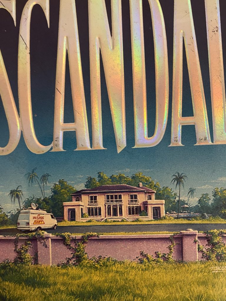
I was also able to tell the publisher what I very definitely do NOT like. For example, I really disliked the cover of my first novel, Scandal (published in 1996) because it was supposed to depict a Palm Beach mansion. But the cover of Scandal shows a mansion with a blacktop forecourt/courtyard. And, un-mown grass in the foreground!!!!
Inaccurate Depiction

No Palm Beach mansion I know, or have ever seen, has a blacktop forecourt or driveway. As for un-mown grass??? Are you kidding??? But then, no-one really asked for my input; I was a debut author.
That said, the original paperback went on to sell more than 70,000 copies — which was pretty awesome back then for a debut author. And, not a single person I know complained about the blacktop in front of the mansion!
So, what do I really know???
Do Book Covers Work For You?
What part does a book cover play for YOU as a reader? I’d like to hear your opinions in the comments below. I’ve already made my top three picks from the 18 draft covers. I am super curious as to what the rest of the CamCat publishing team are thinking?
I’ll keep readers here fully in the know. Maybe even have you weighing in on which of the final selection you like — even though the decision of the publisher will be final!!!!
Another great post Joanna!! I can’t wait to see your final cover. For me, as a reader, I’d be lying if I said I didn’t notice the cover. Sometimes, I even buy a book solely based on the pretty cover lol. Mostly though, I find a great cover won’t sell your book, but a terrible cover will cost you sales. Meaning, what’s inside the cover is far more important than the wrapping 🙂
Thanks, Eldon. I can’t wait to see the final cover either. But given the 18 choices –most of which were pretty spectacular– I’d like to think that I’m going to love whichever the publisher and editorial/marketing team pick as the final choice.
It seems so weird to me that other people are choosing the cover for your book. Difference between indie and trad I suppose 🙂
It’s always been that way with the big traditional publishers. Authors are usually consulted but it depends how big an author you are as to whether any attention is paid to your opinion. When my second book was to be published, I definitely put my foot down for the first cover that was produced for it. If I recall correctly there were shades of pink and green in it. Just horrible. Generally though it is assumed that the marketing and publicity teams have some insight into what would be attractive to readers in an upcoming season. That works for me. So long as I can tell a publisher what I really dislike — and why, I’m happy with that.
One less thing to worry about, I suppose 🙂
That helps, too. As you know, there are so many things to worry about when you’re “birthing” a novel. Finishing the final draft — if there ever is a final draft — is really only just the start of it, isn’t it, whether you’re self-publishing or going with a traditional publisher?
Very true!
Over the years, I’ve always been influenced by the cover of a book. Wandering through bookstores, looking for something that would catch my eye — that was a real pleasure. Today though, I (and i would think, an awful lot of people!) spend WAY less time in bookstores, and more time (for better & worse) on Amazon. So today, I make decisions more on what I’ve read about a book in the print media, and then what the Amazon comments and others have to say. The cover itself has faded to the background for me — at least in terms of book selection. Still do love a great book cover – but not much a part, sadly, of making the selection anymore.
I’m not sure you have to be sad about the fact that a cover doesn’t play that big a role in your selection of a book anymore, Pam. Like you, I tend to select books by author and by reviews I’ve read BUT there are thousands of readers out there who will pick up a book or study a cover on Amazon before opening it to browse or to “look inside.” It is those readers we aim to encourage so that at least they will stop to read the blurb on the cover or the strapline, and then, hopefully proceed from there.